
M.A.D. Marketing was launching PrevenFit, a service for fitness club managers. The marketing site already existed on WordPress, but the subscriber area had been prototyped alongside it and did not hold up. We were asked to design it properly, and it became a standalone Django application.
In pictures
The project in detail
The design was driven by a constraint I set from the start: the tool handles personal data, so it must reveal as little as possible. The search accepts no near matches. It requires the first name, the surname and the date of birth, and answers only on an exact match of all three. You therefore cannot browse the file, nor list it, nor guess your way through it: you can only confirm a record you already hold. The model also enforces uniqueness of the triple, which stops duplicates accumulating.
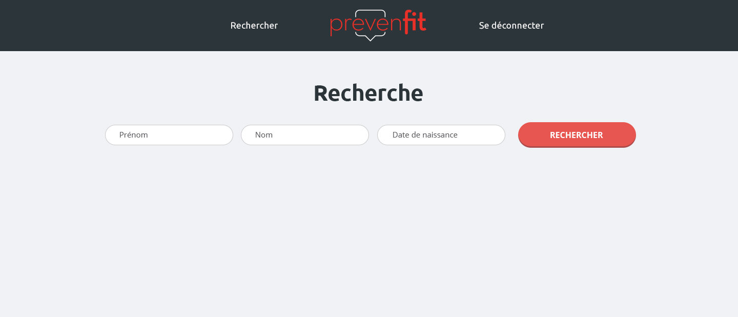
Sign-in is the same for every account. The role stored in the database decides what appears after authentication, the subscriber interface or the administrator's, rather than exposing two different front doors. The subscriber area fits on a single page: the header, the three-field search form, the results area. Nothing else, because nothing else was useful.
Administration is split in two, subscriber account management and data management. Each row carries its actions: edit, delete, enable or disable an account, show or hide a record in search results. Entries are added one at a time or by importing a file following a template we provided, because a client who has to type several hundred rows by hand will not do it.
On the industrial side, the application started from a proven Django skeleton rather than a blank page: configuration through environment variables, dependencies split between development, test and production, Docker containers for all three environments, a gunicorn server in production, tests under pytest with coverage measurement and a gulp chain for the stylesheets. For an application this size, that is the difference between a prototype and something you can operate.
The image on this page is the empty form, and it is the only state of this tool that can be shown: any other screen would display personal data. It happens to be the right one, because it says what the product is. Three fields, one button, nothing else on the page.